In today’s digital landscape, making websites accessible is not just a best practice—it’s a necessity. One of the most crucial aspects of web accessibility is ensuring that users can navigate through your site using only a keyboard. While it might seem like a minor detail, keyboard navigation plays a pivotal role in making your site inclusive to a wide range of users. Whether they have disabilities or simply prefer the speed and efficiency of keyboard shortcuts, a site designed with keyboard navigability in mind is essential. Fortunately, ensuring a site is keyboard-friendly is relatively straightforward when following some fundamental principles.

Focus Indicators: A Visual Guide to Navigation
A key element in creating a keyboard-navigable site is the use of focus indicators. These visual cues are essential for helping users know where they are on a page when they navigate via the Tab key. Focus indicators show which element is currently active—whether it’s a button, link, or form field—and ensure users can track their movements across a site without needing a mouse.
By default, most web elements come with a built-in focus indicator, often presented as a border or outline around the item. However, some designers mistakenly hide these indicators by using CSS properties like outline: 0 or outline: none, which can make navigating with the keyboard frustrating for users. To maintain good accessibility, it’s crucial to keep these focus indicators visible, ideally with a contrast strong enough to be seen clearly against the page’s background.
A great example of effective focus indicators can be seen on the CNN Breaking News homepage. As soon as you press Tab, a bold box appears around the active element, ensuring the user knows exactly where they are. This clear, high-contrast visual cue is vital for an efficient and accessible navigation experience.
Logical Tab Order: Navigating with Intent
While focus indicators help users visually track their position, the order in which the focus indicator moves from element to element is equally important. The flow should be logical and intuitive, following a left-to-right, top-to-bottom order—essentially mimicking how users read in languages like English. This helps create a natural navigation experience, guiding the user in a way that feels seamless and familiar.
Errors in the tab order can disrupt the user experience. For example, if a button is disabled, pressing Tab should skip it entirely, without drawing attention to it or allowing it to become focusable. Additionally, if elements are arranged in an unexpected or disorganized pattern—such as icons moving from right to left instead of left to right—it can confuse users and make navigation feel disjointed.
A great example of poor tab order can be found on the Sutton Maddock Vehicle Rental website. When you press Tab, the focus indicator jumps erratically between elements, moving backward from the “Contact” link to the Facebook link, and then unexpectedly going to the Twitter link. This disordered flow creates unnecessary confusion and disrupts the natural reading pattern.
Skip Navigation Links: Fast-Tracking to the Content You Want

For users who rely on keyboard navigation, the ability to jump straight to the content they care about can be a game-changer. Skip navigation links, which are placed at the top of the page, allow users to bypass repetitive elements—such as navigation bars or headers—and directly access the main content of the page. This is particularly useful for long pages with lots of navigation links or content sections.
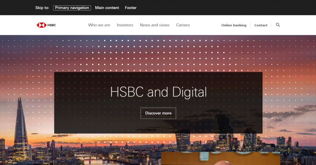
For skip navigation links to be effective, they need to be one of the first elements to gain focus when the Tab key is pressed. This ensures that users don’t need to tab through the entire navigation menu to get to the body of the page. A good example of well-implemented skip navigation links can be found on the HSBC Group homepage. When you press Tab, three clear options allow users to quickly jump to key sections of the site, making navigation faster and more efficient.
Keyboard-Accessible Interactive Elements: Ensuring Interaction without a Mouse
Another critical aspect of keyboard accessibility is ensuring that all interactive elements on a page—such as buttons, links, and forms—are fully accessible via keyboard input. If users can interact with something using a mouse, they should be able to do the same using the keyboard.
This can be accomplished by ensuring that all interactive elements can be selected using the Tab or Arrow keys, and activated using the Enter or Spacebar keys. For example, clicking a button with a mouse should be just as easy as selecting it with the Tab key and pressing Enter to activate it.
Moreover, keyboard accessibility should extend to more complex interactions, such as dropdown menus or modal windows. These elements should also be fully navigable via the keyboard, allowing users to open menus, select options, and close windows without relying on a mouse. Ensuring all interactive elements support keyboard navigation creates a smoother, more inclusive experience for all users.

The Bottom Line: Prioritizing Usability and Inclusivity
Making a website keyboard-navigable is a straightforward yet highly effective way to improve its accessibility. By paying attention to focus indicators, maintaining a logical tab order, adding skip navigation links, and ensuring interactive elements are fully accessible via keyboard, you can make a significant difference in how people interact with your site.
These elements are essential not only for users with disabilities but for anyone who prefers to navigate the web without a mouse. Implementing keyboard-friendly features on your website isn’t just a technical requirement—it’s a step toward creating a more inclusive, user-centric experience that accommodates a diverse range of users.
Ultimately, the goal of web design is to ensure that everyone, regardless of their abilities or preferences, can easily access and interact with your content. By embracing keyboard navigation, you’re helping to make the web a more accessible and efficient place for all.


