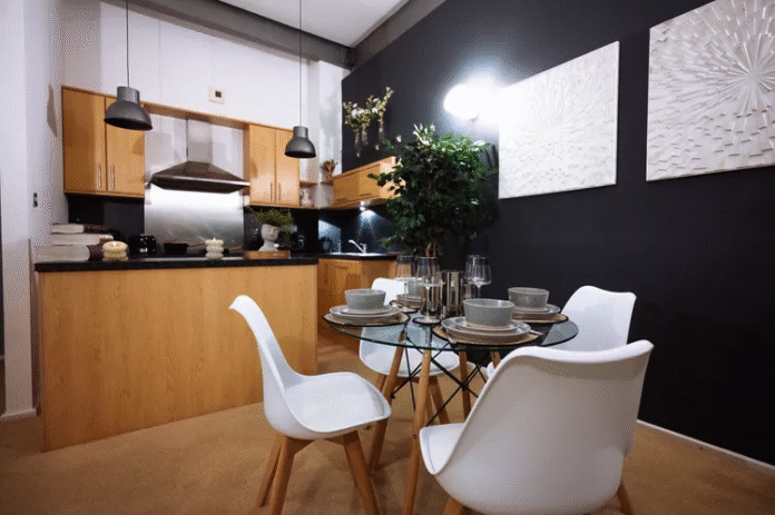
Every January, designers lean in when a major trend authority unveils its forecasted hues for the year ahead. In 2025, Pinterest—the digital mood board for millions—has released its most vibrant palette yet. More than a set of pretty swatches, these six colors reflect cultural shifts, emotional undercurrents, and the push‑and‑pull between bold expression and grounded calm. Whether you work in branding, interiors, fashion, or digital design, Pinterest’s 2025 palette offers both direction and inspiration.
The Six Stars of 2025
Pinterest’s selection spans from playful pastels to statement‑making primaries. Each shade carries a backstory drawn from emerging micro‑trends on the platform:
| Color Name | Character & Inspiration | Trend Roots |
|---|---|---|
| Cherry Red | A fearless primary that demands attention | “Cherry Coded” |
| Butter Yellow | Soft, whimsical warmth—sunny without glare | “Dolled Up,” “Fisherman Aesthetic” |
| Aura Indigo | Moody lilac with cosmic overtones | “Sea Witchery,” “Aura Beauty” |
| Dill Green | Tangy, pickled zest—retro yet refreshingly modern | “Pickle Fix,” “Terra Futura” |
| Alpine Oat | Cozy neutral for layered textures and latte moments | “Peak Travel,” “Moto Boho” |
| [Bonus Shade] | (If Pinterest included a sixth, imagine a balancing tone here.) | (Consider how a bridging color might complete the story.) |
Together, these hues form a narrative arc: from the energizing burst of Cherry Red to the soothing embrace of Alpine Oat. They invite creators to mix fearless accents with calming foundations, mirroring the year’s collective desire for both excitement and stability.
Why These Colors, Why Now?
Pinterest’s annual palette isn’t pulled from thin air. It’s distilled from billions of pins—images, products, and ideas that real people save, share, and shop. In 2025, six themes emerged:
- Optimism with Restraint
After years of upheaval, there’s a hunger for joy—yet tempered by a need for calm. Butter Yellow and Cherry Red deliver cheer, while Alpine Oat offers a resting place for the eye. - Nostalgia Reimagined
Dill Green’s retro “pickled” vibe and the fisherman‑meets‑fairytale warmth of Butter Yellow tap into a longing for simpler times, refreshed for modern sensibilities. - Cosmic Curiosity
Aura Indigo channels fascination with the mystical and unknown, reflecting growing interest in wellness rituals, astrology, and experiential design. - Texture over Flatness
As flat design gives way to layered, tactile experiences—both digital and physical—Alpine Oat and Dill Green pair beautifully with materials like raw wood, ceramic, and bouclé fabrics.
Putting the Palette to Work
How can designers harness these colors effectively?
- Branding & Graphic Design
Use Cherry Red as an accent to command attention—ideal for calls to action or limited‑edition packaging. Balance that intensity with Alpine Oat backgrounds or Dill Green secondary elements to avoid visual fatigue. - Web & UI
Butter Yellow can highlight interactive elements—buttons, notifications, or progress bars—adding warmth to digital experiences. Aura Indigo works well for headers or overlay gradients, lending a sense of depth and intrigue. - Interior Spaces
Imagine an accent wall in Dill Green paired with neutral upholstery in Alpine Oat. Sprinkle in Cherry Red accessories—pillows, vases, artwork—to energize the room. Butter Yellow lighting fixtures or ceramics can bring playful brightness without overwhelming. - Fashion & Lifestyle
Designers might combine Aura Indigo fabrics with Cherry Red stitching or details, creating pieces that feel both edgy and approachable. Butter Yellow accessories—scarves, bags, shoes—can serve as whimsical conversation starters.
Beyond the Swatches: A Catalyst for Creativity
Pinterest’s 2025 palette does more than forecast—it provokes. By juxtaposing vivid primaries with soft neutrals, it challenges creators to blend extremes. It encourages:
- Unexpected Pairings: What happens when you layer Dill Green over Butter Yellow? Or frame Aura Indigo text in Cherry Red?
- Mood Shifts: How can a UI transition from calm (Alpine Oat) to alert (Cherry Red) without feeling jarring?
- Storytelling Through Color: Use the palette as narrative beats—opening scenes in soothing neutrals, climactic moments in bold red, and reflective pauses in indigo.
The Takeaway
A color palette is never just decoration—it’s a lens on culture, emotion, and desire. Pinterest’s 2025 palette captures a moment in time: a collective yearning for optimism grounded by comfort, for nostalgia enlivened by novelty, and for digital and physical worlds that feel both vibrant and humane.
For designers, this curated set of hues is a toolkit and a provocation. It’s an invitation to explore, experiment, and push boundaries—while remembering that the most powerful designs balance bold expression with moments of rest.
So, uncap your digital paintbrush. Let Cherry Red spark your next headline. Let Butter Yellow warm your layouts. Let Aura Indigo transport your audience to otherworldly realms. And when you need a gentle landing, Alpine Oat will be there—always ready to ground your vision in welcoming calm.
With Pinterest’s 2025 Color Palette in hand, the only limit is your imagination.


