
The world of logo design in 2023 has been an exciting one, characterized by bold color schemes, clever symbolism, and a mix of retro charm with forward-thinking aesthetics. Gone are the days of cookie-cutter designs—this year, brands have embraced diversity in visual identity, bringing new energy and creative thought into their logos. Whether tapping into nostalgia or pushing the boundaries with futuristic concepts, the logos of 2023 were a refreshing mix of old and new. Let’s dive into the 10 standout logos of the year.
10. Bolt – Energized and Refreshing
Bolt, the fintech company, introduced a redesign in early 2023 that left a lasting impression. One of the most striking elements of this new logo is its vibrant color palette—no more the typical blue and green we’ve come to expect from many tech brands. The bold, electric hues are an energizing departure from the norm. And then there’s the use of negative space: the iconic lightning bolt cleverly positioned between the “L” and “T,” adding a spark of creativity that makes the logo visually dynamic. In a landscape of repetitive design choices, Bolt’s update stands out as a much-needed breath of fresh air.
9. Nickelodeon – The Return of the Splat
Nostalgia took center stage with Nickelodeon’s 2023 logo redesign. After retiring the iconic splat logo in 2009, the brand listened to the voices of millennial fans and brought it back—but with a modern twist. The new splat is softer around the edges, with a warmer tone that feels more contemporary while still preserving the youthful vibrancy the brand is known for. This redesign cleverly balances nostalgia with modernity, making it both familiar and fresh.
8. Sundance – Minimalism with Meaning
At first glance, the 2023 Sundance logo might seem a little underwhelming, even minimalist. But a deeper look reveals a thoughtful design with significant meaning. The logo’s proportions mirror the 16:9 cinematic widescreen ratio, subtly paying homage to the importance of film. This is a great example of how a simple design can carry a deep message. Paired with bold monochromatic colors and the sharp Monument Grotesk typeface, this logo is as functional as it is symbolic—a smart choice for a film festival with a rich history.
7. Mozilla Thunderbird – Clever and Cohesive
Mozilla’s Thunderbird email client rebrand was one of the most intelligent design moves of the year. The new logo cleverly integrates elements from the company’s previous Firefox logo—specifically, the animal imagery and the fiery color scheme—while introducing a bird to symbolize email. The design swaps out the fiery orange for a cool blue tone, creating a yin-yang effect. This redesign keeps Thunderbird aligned with Mozilla’s visual language while introducing a fresh identity that feels right at home in 2023.
6. Hodder & Stoughton – A Stoat for Pronunciation
In a brilliant move, UK publishing house Hodder & Stoughton incorporated a stoat into their new logo to help people pronounce the company’s name correctly. The playful mascot isn’t just for fun—it’s a nod to the proper pronunciation, which, according to the company, sounds like “stoat-on.” This quirky yet functional redesign brings a fresh sense of personality to the brand and generates a conversation around an otherwise staid industry. The stoat may not be the most obvious choice for a logo, but it certainly makes a memorable impact.
5. Jell-O – Fun is Back on the Menu
Jell-O’s 2023 logo redesign marked a bold shift from its previous attempts to position the brand as a health food. The new logo is playful, colorful, and infused with a healthy dose of nostalgia. With thick drop shadows and a vibrant color palette, the new Jell-O logo embraces the fun, quirky spirit of its past rather than trying to be something it’s not. This redesign returns Jell-O to its roots, aligning it with the lightheartedness and enjoyment it’s always promised to deliver.
4. Nokia – A Fresh Start with Familiarity
Once a giant in the mobile phone market, Nokia’s logo redesign in 2023 signaled a desire to reconnect with the modern world while honoring its legacy. The new logo is a sleek update to the classic Nokia typeface, designed to be simpler and more streamlined. While it may not be as eye-catching as some of the other entries on this list, it serves its purpose well. It’s a visual acknowledgment that Nokia is no longer just the relic of the past but a brand ready to compete in the contemporary market.
3. 7Up – Simplicity Done Right
7Up’s 2023 logo overhaul is a textbook example of minimalist design executed perfectly. The new logo strips away the unnecessary elements from the old design and brings the brand’s core visual identity front and center. By focusing on bold, 3D drop shadows and a high-contrast color scheme, 7Up’s new logo feels fresh, vibrant, and, most importantly, fun—just like the drink itself. This redesign takes what people love about 7Up and amplifies it in the simplest way possible.
2. Burberry – Embracing Heritage with Style
Burberry’s 2023 logo redesign was a long-awaited return to the brand’s roots. After years of minimalism, the brand resurrected its iconic Equestrian Knight logo with an updated, modern twist. The new design combines an antiquated sans serif font with the beloved Knight, giving the logo a sense of elegance and heritage. Burberry’s return to a bolder, more distinctive identity feels like a rebirth of the brand’s rebellious spirit, making it one of the most exciting logo updates of the year.
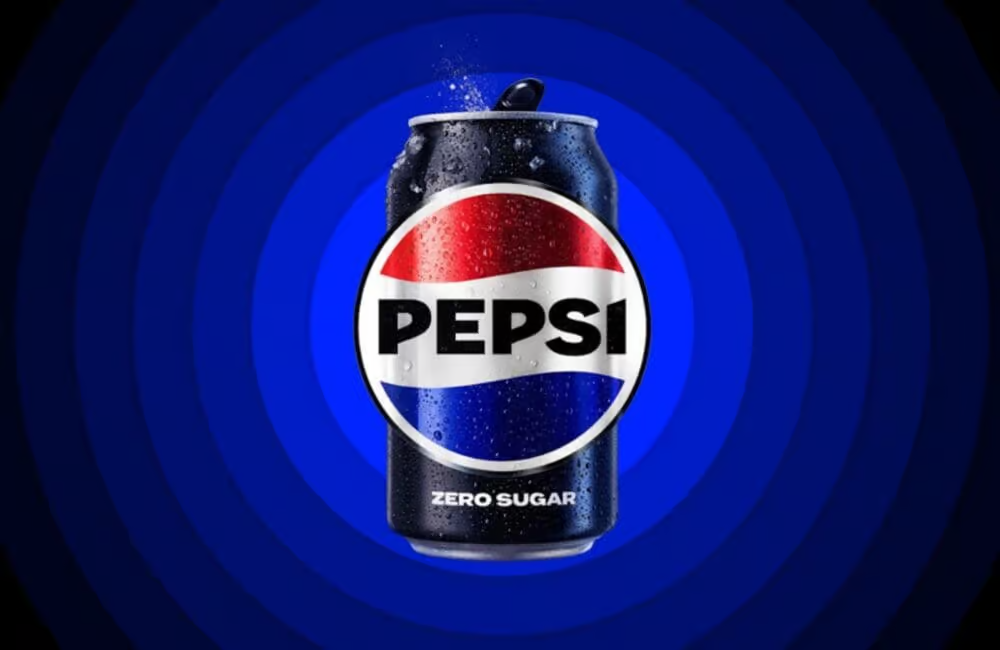
1. Pepsi – Back to the Roots
Pepsi’s 2023 logo redesign was not just another marketing gimmick; it was a celebration of the brand’s legacy. For their 125th anniversary, Pepsi unveiled a vintage-inspired logo that harkens back to the 90s. The refreshed logo feels like a tribute to the brand’s golden years, with a modern twist that keeps it relevant today. It’s a nostalgic yet forward-thinking move that restores Pepsi’s sense of identity without trying too hard to be trendy or minimalist. This redesign wasn’t just necessary—it was overdue, and it’s a perfect reminder of the power of brand consistency.
Conclusion
The logos of 2023 showcased a fascinating mix of creativity, nostalgia, and forward-thinking design. From vintage-inspired updates to minimalist revamps, these brands proved that logos can be more than just visual symbols—they can tell a story, evoke emotion, and build a connection with their audience. As we look ahead to 2024, one can only wonder what bold, new designs will emerge, but if they’re anything like this year’s best, we’re in for some exciting changes.


