

In an era where retail giants constantly strive to stay relevant, Walmart has made a bold statement with the unveiling of its updated brand identity. Announced on January 13, 2025, this rebranding seeks to blend Walmart’s rich heritage with a fresh, forward-thinking approach. By modernizing its visual presence, the company is embracing change while honoring the principles that have made it a household name. With a refined logo, updated color palette, and an emphasis on accessibility and sustainability, Walmart is signaling its readiness for the future.
A Thoughtful Design Evolution
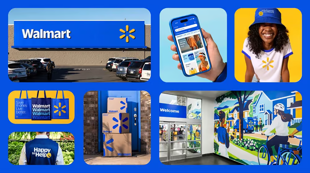
Walmart’s new design offers a fresh perspective without abandoning the values that have shaped the brand for decades. At the heart of the update is a logo that still includes the recognizable spark and deep blue color synonymous with Walmart, yet with subtle refinements that lend it a more modern, streamlined look.
The updated wordmark takes inspiration from the iconic trucker hats worn by Walmart founder Sam Walton, reflecting a sense of tradition while using contemporary design techniques to create a distinctive, custom font. This clever nod to the company’s roots ties the brand to its legacy, while the refreshed design points to its future aspirations.
The color palette has also been updated. The signature “True Blue” and “Spark Yellow” remain at the core of the brand’s identity, but the hues have been adjusted to feel more vibrant and contemporary. These colors are carefully balanced to evoke a sense of familiarity and nostalgia, while simultaneously creating a new visual experience that appeals to today’s modern consumer.
This refreshed design is part of a broader strategy aimed at maintaining Walmart’s relevance in an increasingly competitive retail market. But the brand isn’t just focused on visual aesthetics—its approach is guided by a commitment to accessibility, sustainability, and inclusivity, ensuring that the design appeals to a diverse range of customers.
Inclusivity and Accessibility at the Forefront
Perhaps one of the most noteworthy aspects of Walmart’s rebranding is its emphasis on accessibility. In an era where brands are becoming increasingly aware of the need for inclusivity, Walmart’s updated design system places a strong focus on ensuring that everyone, regardless of ability, can interact with the brand seamlessly.
The new visual identity incorporates user-friendly typography and high-contrast color schemes that improve readability, particularly for customers with visual impairments. This commitment to accessibility reflects Walmart’s dedication to providing an equitable shopping experience for all. By prioritizing these design elements, Walmart aims to enhance customer satisfaction and ensure that its visual identity is welcoming to a wider audience.
But the changes don’t stop there. The company has also placed a strong emphasis on sustainability throughout the rebrand. Eco-friendly materials and designs have been integrated into packaging, signage, and in-store displays to minimize the environmental footprint. As part of its long-standing commitment to sustainability, Walmart is aligning its design overhaul with broader goals to reduce waste and carbon emissions, demonstrating a forward-thinking approach that resonates with eco-conscious consumers.
Potential Challenges and Criticisms
As with any major rebrand, Walmart’s new look is not without its criticisms. Some observers have raised concerns about the shift in the brand’s color scheme, particularly the darker blue used in the new logo. While this more sophisticated shade may work well in certain contexts, critics argue that it feels less inviting and approachable compared to the lighter blue the brand had used for years.
In addition, the updated typography, while bold and clear, has drawn some criticism for being too utilitarian. Though the thicker font offers legibility and simplicity, it may lack the warmth and friendliness typically associated with Walmart’s customer-centric image.
The minimalist approach to design—particularly the reduction of clutter and the emphasis on digital scalability—may be well-suited for online platforms but could struggle to stand out in the physical retail space. In a marketplace saturated with visual stimuli, critics worry that the streamlined aesthetic could blend into the background, making it harder for Walmart’s in-store experience to command attention.
Looking to the Future
Despite these potential drawbacks, Walmart’s rebrand signals an exciting new chapter for the company. The changes aren’t just about a new look—they reflect a larger vision for the future of retail. The company has indicated that this rebrand is part of a broader strategy to enhance customer experience both online and offline. Future innovations, including improvements to Walmart’s mobile app, more efficient checkout processes, and expanded omnichannel services, are set to roll out alongside the updated design.
The company’s ongoing commitment to innovation and customer-centric service is evident in every element of this rebranding. The logo update, the more modern color scheme, and the focus on accessibility are all steps toward ensuring that Walmart continues to meet the needs of an ever-evolving consumer base. With these changes, Walmart is positioning itself not just as a retailer, but as a dynamic and forward-thinking brand that embraces both its past and its future.
In the coming months, customers can expect to see these design updates across Walmart’s stores, online platforms, and marketing materials. This rollout marks the beginning of an exciting new chapter for the brand, one where tradition and innovation go hand in hand. Whether or not this rebranding will achieve its full potential remains to be seen, but it certainly sets the stage for a new era in Walmart’s long and storied history.


