

As YouTube marks its 20th anniversary, the company has quietly—but meaningfully—refreshed one of its most recognizable brand elements: its iconic red. But this isn’t just a cosmetic tweak for the sake of nostalgia or marketing fanfare. The transition from YouTube’s classic flat red to a dynamic red-to-magenta gradient represents a careful, strategic evolution—one that speaks volumes about the platform’s commitment to inclusivity, accessibility, and forward momentum.
Let’s explore what this change means—not just for users and creators—but for the broader world of design and digital branding.
A Subtle Change, A Significant Shift
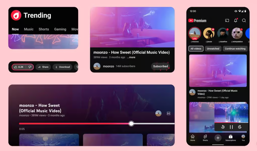
At first glance, the new red might seem only marginally different from its predecessor. But upon closer inspection, it becomes clear that this is a carefully engineered update. The gradient—a gentle transition from rich red to vibrant magenta—adds depth and dimension that the previous flat red simply didn’t have. It softens the visual impact, making the platform feel more approachable and less stark.
This isn’t just a stylistic upgrade. It’s a decision rooted in user experience and visual accessibility. The old red, bold and punchy as it was, didn’t always play well on every screen. On older monitors or low-quality displays, it could look oversaturated or even jarring. By shifting to a gradient, YouTube ensures its color remains visually consistent across a wide range of devices, from flagship smartphones to budget tablets.
The Gradient as a Metaphor
Beyond its visual appeal, the red-to-magenta gradient serves as a symbol of YouTube’s evolution. Gradients suggest movement and change—something fluid rather than fixed. That’s a fitting metaphor for a platform that has constantly reinvented itself over the past two decades, transitioning from a scrappy video-sharing site to one of the most influential digital ecosystems in the world.
Magenta, in particular, is a compelling choice. Unlike orange or yellow, which were reportedly considered during the redesign process, magenta rarely appears in the natural world. It’s a color associated with imagination, digital culture, and the future—precisely the values YouTube wants to emphasize as it charts its next 20 years.
Placing the magenta at the end of a diagonal gradient that tilts upward and to the right visually reinforces this theme. It’s a quiet but clear nod to progress, energy, and creative momentum.
A Better Experience Across the Board
Design isn’t just about aesthetics—it’s about usability. One of the most meaningful impacts of the new red gradient is how it improves the user interface. Elements like the Like and Subscribe buttons have been subtly enhanced. They now appear more dynamic and interactive without becoming flashy or intrusive.
That’s a big deal. YouTube’s UI is used by billions every day. Even a slight shift in color tone can affect user behavior. The new red is more inviting, making it easier to see and interact with key interface elements. It encourages engagement while maintaining a clean, modern look.
What’s also noteworthy is what didn’t change. YouTube resisted the temptation to redesign for the sake of novelty. The platform’s layout, functionality, and overall structure remain intact. This was a thoughtful refinement, not a full-scale overhaul—showing that design evolution doesn’t always have to be disruptive to be effective.
Lessons for Designers: The Power of Detail
For design professionals, YouTube’s shift is a textbook example of the power of restraint and precision. Often, the most impactful changes are those that don’t scream for attention, but instead enhance the user experience in subtle, meaningful ways.
The update emphasizes the importance of consistency—how a single hue, when refined with care, can improve accessibility, brand cohesiveness, and emotional tone. It’s a reminder that the smallest details—like a gradient direction or color pairing—can carry tremendous weight when applied across a global platform.
It also highlights the value of thinking beyond the surface. YouTube didn’t just pick a new color because it looked better on modern screens. They chose it because it told a story—one about movement, inclusion, and the imagination that fuels their creator community.
A Unified Visual Identity
Another practical outcome of this change is visual unification. Previously, some secondary icons and topic channels used a diverse range of palette accents, which could lead to a fragmented look and feel. With this new red at the core, those visual elements now feel more cohesive. It’s a move that helps create a seamless visual language across all of YouTube’s touchpoints.
This type of design discipline—creating a strong central color identity and allowing it to inform other parts of the UI—helps platforms stay consistent even as they grow and diversify.
A Forward-Looking Touch for a Timeless Platform
YouTube’s new red may not be revolutionary, but it is intentional—and that’s what makes it meaningful. It shows a deep understanding of design’s evolving role in shaping digital experiences. The update isn’t just a nod to the past two decades; it’s a bridge to the future, signaling that YouTube is still innovating, still listening, and still refining.
In a digital world where rebrands can often feel abrupt or disjointed, YouTube’s approach feels organic. It respects the brand’s legacy while pushing gently—and confidently—into its next chapter.
So, next time you notice that slightly softer, more vibrant red while watching your favorite video, remember: it’s not just a new look. It’s a signal that YouTube, like all great platforms, knows that evolution is often best achieved through careful, deliberate change—not flashy reinvention.


