

By the time the internet began to seep into daily life, there was one feature nearly everyone could agree on: blue meant clickable. That unassuming shade of hyperlink blue didn’t just color our digital experience—it defined it. A soft hue, underlined, quietly beckoning: “Click here for more.” It wasn’t glamorous, but it worked. It worked really well.
But like all great fashion staples—from Levi’s jeans to black turtlenecks—the classic blue link has been reimagined, redesigned, and in many cases, entirely replaced. Welcome to the era of the rainbow hyperlink—a world where flair often trumps function, and users are left wondering if the rules of the web they once knew still apply.
Blue Was More Than Just a Color
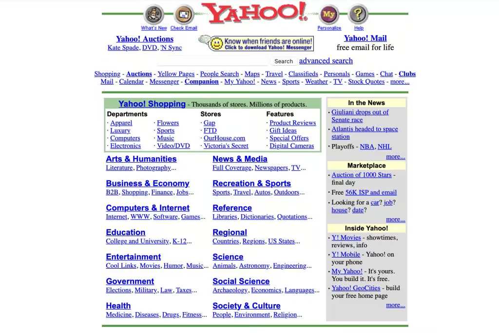
In the early days of the web, blue wasn’t chosen because it was trendy. It was chosen because it stood out. On the washed-out CRT screens of the 1990s, blue was one of the few colors that popped against the gray and white interface backgrounds. It became a visual contract: if it’s blue and underlined, it leads somewhere.
And the beauty of it? Consistency. No matter which site you visited, blue links behaved predictably. You knew where to click, what you had clicked, and what not to bother clicking again, thanks to that warm companion of the blue link—the visited link purple. Blue was the invitation. Purple was the receipt.
The New Wave of Link Fashion
But nothing stays static on the internet. The modern web is sleek, tailored, and branded within an inch of its life. Hyperlinks are no longer just functional—they’re expected to be on brand. That might mean neon green for a Gen Z fashion blog, dusty rose on a wellness site, or no color at all on minimalist, text-heavy interfaces.
Now, links come in gradients, glow with hover animations, and dance subtly (or obnoxiously) with effects that practically scream, “Look at me!” A few change color on hover, others increase in size or blur out entirely. And if you’re lucky, you might stumble upon one that spirals like it’s on a carousel.
Designers have clearly had enough of the “boring blue.” They’re dressing links up in a thousand digital fabrics—some silky and elegant, others loud and confusing. It’s a revolution of color, yes. But revolutions are rarely without casualties.
When Fashion Hurts Function
Let’s be honest: not every hyperlink makeover is a success.
Consider the trend of links disguised as normal text—same color, no underline, no hover cue. You find yourself dragging your cursor across the screen like you’re hunting for treasure. Is that word clickable? Maybe. Only one way to find out.
Or how about sites that use links so faint they practically blend into the background? Congratulations, you’ve just made an Easter egg out of basic navigation. And let’s not forget the forgotten purple—a relic of the past. Without a visited-link indicator, users can easily get stuck in a Groundhog Day-style loop of clicking the same article five times without realizing it.
This kind of “clever” design isn’t clever at all. It’s frustrating. It breaks a user’s trust in the interface. Because what is a hyperlink if not a promise?
The Power of the Purple Link
We need to talk more about visited links—those subtle purple guides that once helped us map our path through the digital wilderness. Today, many websites disable visited link styling entirely. In the name of aesthetic purity, they erase this humble trail marker and leave users to wander aimlessly.
Remember the purple link? It was a quiet confirmation, a soft pat on the back: “You’ve been here. You’re making progress.” Getting rid of it feels like taking signposts off a hiking trail because they didn’t match the forest décor.
Bringing Back Clarity (Without Killing Creativity)
None of this is to say that all modern link design is bad. Colorful, styled hyperlinks can add visual interest and align beautifully with a site’s personality. A smartly designed pink link on a fashion site makes sense. So does a muted green on an eco-brand’s homepage. There’s room for creativity—a lot of room.
But in the pursuit of aesthetic, we’ve lost sight of the basics. Links should always be identifiable as links. They should be clear, they should stand out, and they should offer users feedback about where they’ve been.
As users, we rely on visual cues to guide us through interfaces, whether we’re reading a blog post, browsing a product catalog, or diving into an online rabbit hole of Wikipedia pages. When those cues are missing or inconsistent, we don’t feel innovative—we feel lost.
The Circle Will (Probably) Complete Itself
Design trends are cyclical. What was once considered outdated often comes back into style. Maybe one day the blue hyperlink will be retro-chic again, celebrated for its clarity and nostalgic charm. Perhaps designers will rediscover the power of the purple visited link and reintroduce it as a “vintage UX feature.”
Until then, we live in a world of hyperlinks dressed to impress. Some dazzle. Some disappear. And somewhere in the middle lies the ideal balance: beauty that enhances usability, not replaces it.
So, here’s to the hyperlink in all its evolving glory. May it be stylish and clear, fashionable and functional. And to the classic blue? You may no longer dominate the web, but you’ll always have a place in our hearts—and in our browser histories.


