

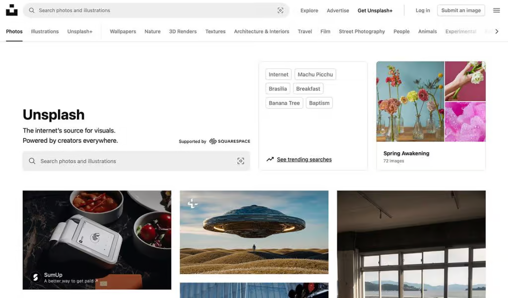
Unsplash, renowned for its vast collection of stunning, free stock photos, has long been a go-to resource for creatives, designers, and marketers alike. However, one glaring issue has surfaced on their homepage that many users can’t help but question: why does Unsplash feature two search bars? In a space where simplicity and user-centric design are key, this addition seems out of place, complicating an otherwise streamlined user experience.
Before diving into why this design decision is problematic, let’s acknowledge the obvious: Unsplash offers a fantastic service. Its image library is unrivaled, and the free, high-quality photos it provides have been game-changing for countless users. But great content doesn’t automatically justify poor design decisions. The two search bars on the homepage, though seemingly harmless, introduce unnecessary complexity that ultimately distracts from the user experience.
The Case for Simplicity in Web Design
Web design thrives on clarity and simplicity. Visitors to a website often decide whether or not they want to continue engaging within mere seconds of landing on a page. A clean, intuitive interface can make the difference between a user staying to explore content and quickly bouncing to a competitor.
So, what message does it send when a user’s first interaction with Unsplash’s homepage is an interface that feels cluttered and confusing, offering them two search bars that look nearly identical? Instead of providing an immediate, straightforward path to the content users are seeking, this redundant feature overwhelms users and muddies the waters.
Two Search Bars, But Why?
On the surface, it might seem like a minor detail, but a closer look reveals that these search bars aren’t exactly distinct. One of them is marked with a subtle “Supported by Squarespace” label, yet the results returned by both bars are identical. So, why the duplication? If the results are the same, what’s the purpose of offering two seemingly identical options?
This duplication isn’t just an inconvenience for first-time users; it’s an issue for returning visitors too. The subtle difference between the two bars isn’t enough to clarify their purpose, leaving users puzzled about why both exist. It’s a design misstep that could easily have been avoided with a more streamlined approach.
Prioritization: A Crucial Web Design Principle
In web design, one of the most important principles is prioritization. If you’re offering multiple options, each should serve a distinct, clear purpose. The reality is that when you give users too many choices, it often leads to decision fatigue and confusion. In Unsplash’s case, the dual search bars don’t offer more choices—they just add unnecessary complexity.
By offering two identical search bars, Unsplash is effectively saying, “We’re not sure which search you want, so here are both.” This approach doesn’t clarify the navigation; it muddles it. A single, focused search bar would streamline the experience and eliminate any ambiguity, creating a more intuitive user interface.
How Did This Happen?
Given Unsplash’s reputation for innovation and their focus on user experience, how did something as seemingly simple as a homepage design get overlooked? It’s likely that in their effort to cater to as many users as possible, they ended up overcomplicating the design.
While options are often seen as a positive feature, they can backfire when they become redundant. The addition of a second search bar on the homepage might have been an attempt to offer more flexibility or emphasize a partnership with Squarespace, but it ultimately ends up being distracting. This decision seems to have missed the mark in terms of balancing functionality with simplicity.
Is It Really That Big of a Deal?
At first glance, two search bars might not seem like a huge issue, but for a platform that prides itself on its design-savvy user base, it stands out. Unsplash’s audience includes designers, developers, and other creatives—people who tend to pay attention to even the smallest details in design. This is a crowd that values clean, purposeful interfaces. In an industry that often prizes simplicity, the presence of two search bars feels out of place.
It’s not just about aesthetics—it’s about functionality. Unsplash has always strived for a user-friendly platform, but by introducing redundant elements like these search bars, they risk undermining their own commitment to clarity and ease of use.
The Power of Streamlined Design
The solution is straightforward: streamline the homepage design by consolidating the two search bars into one. There’s no need to clutter the page with redundant options when a single, well-designed search bar would do the trick. A search bar is meant to be a tool, not an obstacle, and it should guide users toward the content they’re looking for with as little friction as possible.
If Unsplash wanted to maintain the appearance of two search bars for some reason—perhaps to highlight a partnership or provide different types of search functionality—they could differentiate the two more clearly. One could be focused on a more specific search, while the other could remain broad and flexible. But, in reality, this is likely unnecessary. One search bar, done right, is more than enough.
Conclusion: Less Is More
Ultimately, the core of good web design is simplicity. Unsplash is undeniably successful in providing an invaluable resource to its users, but the two search bars on its homepage detract from the very thing that makes the site successful—ease of use. A cluttered homepage creates friction, and friction is the enemy of a smooth user experience.
The takeaway here is simple: less is more. Instead of overwhelming visitors with unnecessary complexity, Unsplash should embrace a cleaner, more focused homepage design. A single search bar, neatly positioned and easy to use, would improve the overall experience and align with the principles of great design.
It’s time for Unsplash to clean up its homepage and give users what they need: a simple, intuitive interface that puts the focus on discovering beautiful images, not figuring out how to search for them.


